
No inquiries on your foreign trade independent site? It's often stuck on “images not matching the product”: a 4-point self-check list
After your website has been live for two or three months and Google has indexed it, inquiries are still in the single digits—the problem often isn't website building, but that your images and page content don't match what overseas buyers want to see. This article provides a 5-point self-check list to help you pinpoint where the “image-product mismatch” is; it divides image improvements into three tiers—taking photos yourself, domestic photography outsourcing, and overseas shooting—with time requ
目录
- If buyers click in and leave within 5 seconds, it's usually because the images don't match the product
- Image improvements come in three tiers; cost and time can differ by 10x
- Even if the images are right, failing to fix these 4 page areas still won't retain visitors
- In the first 30 days after launch, review on this schedule
If you're also struggling with “images that don't match the product,” this post is worth reading to the end:
Your website has been live for two months, Google has indexed dozens of pages, yet inquiries are still in the single digits.
Ad clicks aren't necessarily few, but people take one look and leave. The problem often isn't website building—it's that the images and content you post don't match what buyers want to see.
If buyers click in and leave within 5 seconds, it's usually because the images don't match the product
When overseas buyers open an unfamiliar website, in the first 5 seconds they only look at three things: who you are, what you sell, and whether you can ship on time.
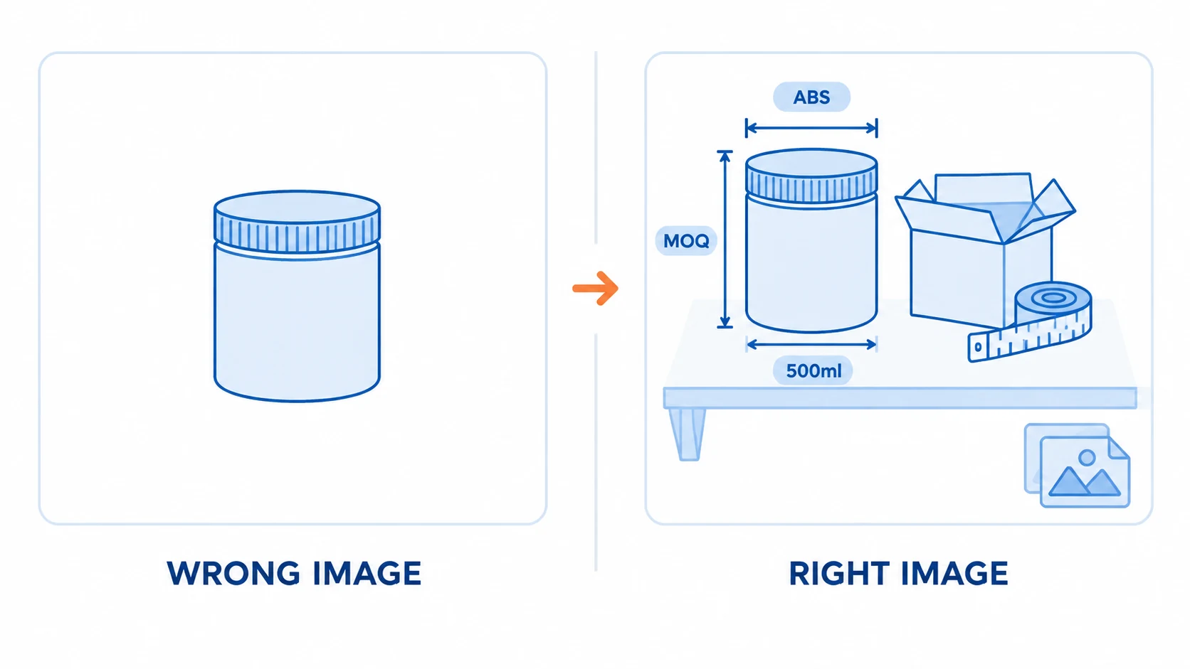
Those three things can't be explained clearly by a single lonely white-background image.
Wholesale buyers want to see specifications, packaging, MOQ, and production lines; retail end buyers want to see usage scenarios and real results.
If one image satisfies neither side, that's a typical case of the image not matching the product.
Another often overlooked point: language. If an English page uses Chinese watermarks or photos of Chinese packaging, the buyer's first reaction is, “This isn't for me.”
First run a self-check against these 5 items:
- Is the main image “product + usage scenario,” or just a white-background product shot;
- Does the image have English annotations: dimensions, capacity, material, MOQ;
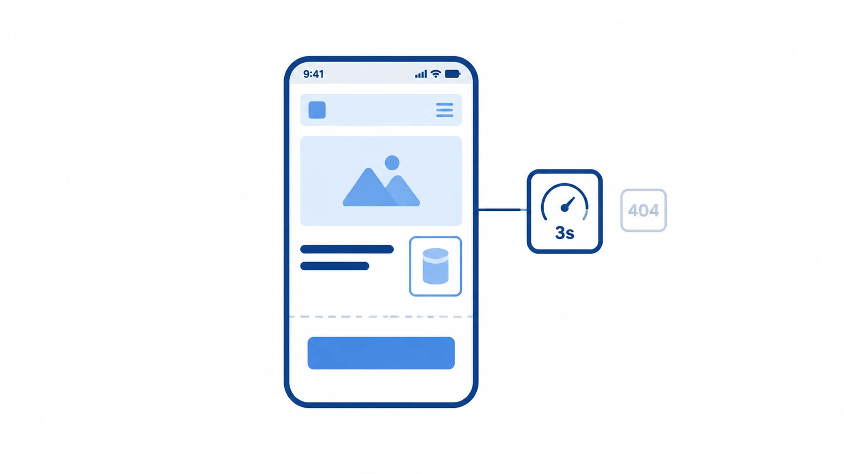
- Is each image compressed under 200KB, and can it load on mobile within 3 seconds;
- Does every featured product have more than 3 images: overall, detail, and usage scenario;
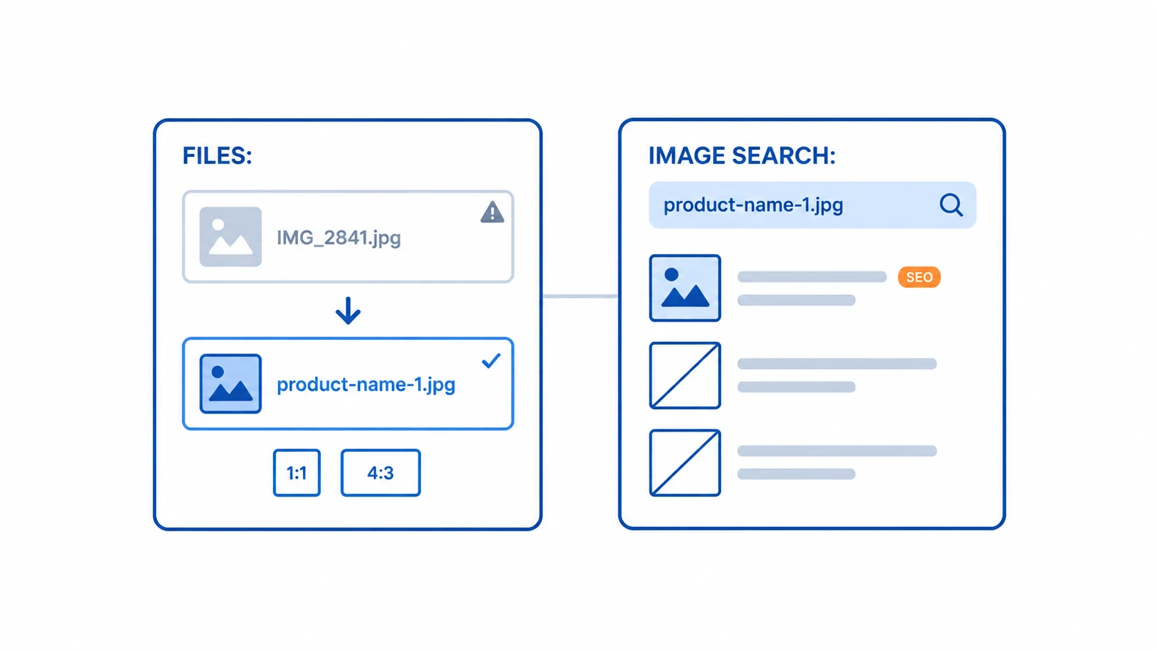
- Are the image filenames still called IMG_2841.jpg.
Also, image ratios are best standardized to 1:1 or 4:3, so listing pages don't look uneven.
The last item is the easiest to overlook. Changing filenames and alt text to something like product-name-1.jpg is a zero-cost step that helps Google Image Search find you.
This part goes hand in hand with foreign trade SEO and promotion; if your images aren't organized, later keyword and backlink work won't gain traction either.
Image improvements come in three tiers; cost and time can differ by 10x
You don't have to hire professional photography right away. Dividing it into three tiers by budget makes decisions faster.
| Tier | How to do it | Time per product/style | Common market price range |
|---|---|---|---|
| Take them yourself | Phone + natural light by a window + white backdrop paper, shoot 5 per product | 20–30 minutes | 0 yuan (backdrop paper 20–50 yuan) |
| Domestic photography outsourcing | White-background images + scene images, including basic retouching | Images delivered in 3–7 days | White-background images 20–80 yuan/image, scene images 50–150 yuan/image |
| Overseas shooting or 3D rendering | Tailored to local aesthetics, including models, props, and scenes | 1–3 weeks | From 200–800 yuan/image |
The benchmark is simple: if a site gets fewer than 10 inquiries per month, start with the first tier and don't rush to spend big money.
If you have many product colors and styles, start with the top 20 best sellers—don't roll it out across everything.
Cleaning up the images for 20 featured products is more useful than putting one blurry image on each of 200 products.
By the way, image costs usually account for only a small part of the whole site budget. For how to calculate fixed items like domains, servers, and templates, see website building costs and quotes.
For exactly how many shots your products and market need, and whether to use 3D, an assessment based on your requirements is needed—feel free to consult us.
Even if the images are right, failing to fix these 4 page areas still won't retain visitors
Images are only the first hurdle. If buyers scroll down and the following areas don't meet the mark, they'll still leave.
- First screen: company name + one sentence “what we do and who we sell to” + 1 featured product + inquiry button, all visible within one screen;
- Inquiry form: keep fields to 3–5 (name, email, country, requirements); beyond 7, completion rates drop noticeably;
- Contact channels: provide at least two of WhatsApp, email, and form; leaving only one email is almost a turn-off;
- Mobile: if it takes more than 3 seconds to open on a phone, more than half of people won't wait.
Form fields aren't the fewer the better, nor the more the better. Things like company size and annual procurement volume can be asked later in email exchanges—don't put them on the first screen and block people.
These four items are routine actions in inquiries and conversion; they don't require custom development—just set them up while building the site.
In the first 30 days after launch, review on this schedule
| Time | What to do | What to focus on |
|---|---|---|
| Week 1 | Submit sitemap, install analytics tools | Indexed pages |
| Week 2 | Replace main images, fill in product detail images | Bounce rate, average time on page |
| Weeks 3–4 | Adjust form fields and contact channels | Form submissions |
| From month 2 | Once things are running smoothly, consider Google Ads | Cost per inquiry |
Don't rush to look at inquiry counts in Week 1. A new site has almost no organic traffic in the first two weeks—that's normal. Focus on indexing first.
You don't need to check every day; reviewing on one fixed day each week is enough.
Two hard metrics: if the bounce rate stays above 70%, fix content and images first—don't run ads; if average time on page is under 30 seconds, fix the first screen first.
Write down this image-production approach and apply it directly next time you launch new products.
If you'd like someone to review your images and pages against your product line and target market, you can start with a free website-building needs assessment.